
UPCOMING SHOWS
BE THE FIRST TO KNOW
BE THE FIRST TO KNOW WHEN I'M IN YOUR CITY
- About Upcoming Shows near you!
- Get Early Access & Exclusive Offers
- No SPAM! Just the Good Stuff
CORPORATE COMEDY

Hire Don to be a comedian, emcee, host, fake expert, and much more for your event!
I work with clients ahead of time to make them a show just for them!
Don can be your event host, fake expert, comedian, emcee, or he can make you custom comedy videos! When you Book Don for your company event you don't just get a canned comedy show - Don creates Custom Corporate Comedy shows JUST for your group!
WATCH CLIPS
ABOUT DON
AMERICA'S #1 NERDY COMEDIAN
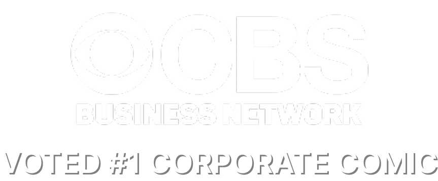
What do you get when you cross an Engineer with a stand-up comedian? You get Don McMillan. This former chip designer has been doing his one-of-a-kind, PowerPoint-Driven comedy show for audiences for over 20 years. In his show packed with graphs & charts, Don will show you the funny side of your world that has been sitting right in front of you - you are just too busy working to notice. Don graduated from Stanford University with a Master's Degree in Electrical Engineering. He then went to work at AT&T Bell Labs where he was part of the team that designed the world's first 32-bit microprocessor. He then moved to Silicon Valley where he helped launch the start-up company, VLSI Technology. Then after 15 years in the tech world, Don quit his job to become a stand-up comedian. That year he won $100,000 as the Comedy Grand Champion on "Star Search". Don's been seen on "The Tonight Show", "HBO", and the "Comedy Central". These days, Don spends most of his time writing and performing customized corporate comedy shows for companies like Google, Apple, Amazon, Microsoft, Ford Motors, and Exxon/Mobil. Don has performed more than 800 corporate shows in the last 20 years and he was named the #1 Corporate Comedian by the CBS Business Network. Currently, you can check out his YouTube Channel here.
Ready to book the comedian that makes nerdy cool and any event unforgettably hilarious?

GET IN TOUCH
Corporate comedian Don McMillan is available for your next event, or to answer your questions. Just fill out the form and we'll reach out in 24 hours or less.
We're excited to hear from you!
Fill out the form to contact Don and get your custom comedy plan that EVERYONE will love. We will get back to you as quickly as possible!
PHONE: +1 661-312-6011
EMAIL: [email protected]
©2025 DON MCMILLAN | POWERED BY UPNEX [AN UP HIGH COMPANY] | Terms & Condition | Privacy Policy